
This is my 24th post, although the idea for it was born almost 10 months ago when I published my very first entries. Even then, I was already thinking about creating a logo—or rather, various versions of a logo. I wanted to combine a logotype and a logomark into a coherent visual identity, incorporating typography and color theory. My goal was to present how multiple versions of a single symbol could represent one subject.
Today, a logo is often a simplified icon—a monogram or characteristic graphic symbol, appearing in various color versions: black and white, achromatic, or chromatic. It’s a broad topic. Sometimes a logo is accompanied by a name, sometimes by a visual reference. Personally, I also wanted the logo to have a sense of “movement”—the ability to change colors or layout.
Many contemporary designers favor simplicity, which often results in repetition and a lack of detail. Of course, it’s hard to imagine the „NIKE” logo without its minimalist form—but I also wanted to create something with character, detail, and story. Something timeless, yet adaptable. Over time, I made a clear decision: I would create a seal for Zabierzów Bocheński.
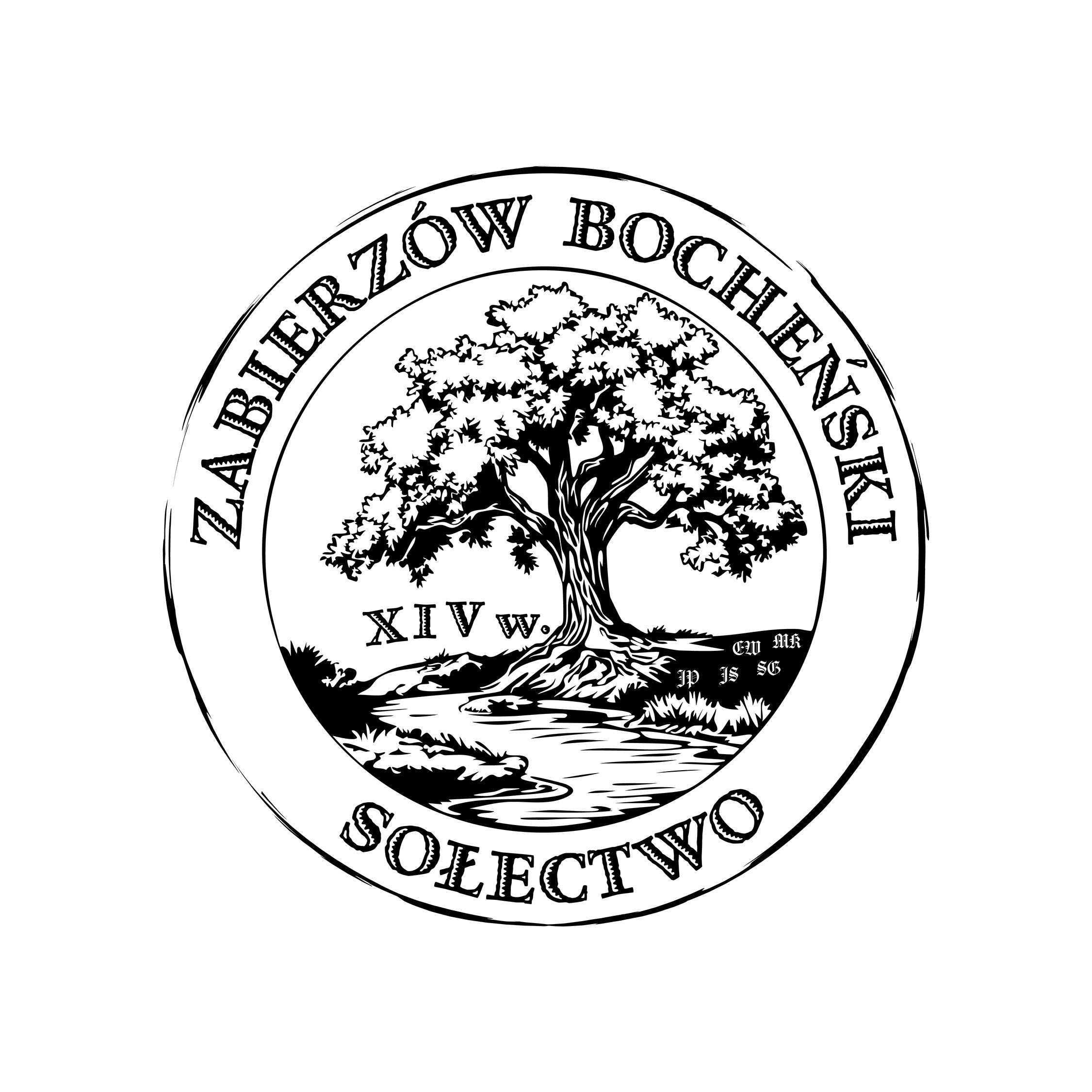
I abandoned multiple logotype and logomark versions and ultimately settled on one unified concept. The logomark became a stylized tree, and the logotype—the full name of the village.
Zabierzów Bocheński is a picturesque village by the Vistula River, located about 30 km east of Kraków, with a population of nearly 1,800. The project was created in cooperation with the village mayor, Magdalena Kuźba, and is currently in its final stage.
Instead of focusing on categorizing the type of logo, I decided to emphasize the creative process and inspirations behind it.
At the outset, I dove into the village’s history and medieval methods of symbol-making. I spent a lot of time in the Niepołomice Municipal Library, reading heraldic books and works by Julian Zinkow, such as “Around Niepołomice and the Niepołomice Forest” and “Myślenice and Surroundings”.
I also studied the history of Niepołomice itself—its coat of arms, flag, and anthem. To better understand the origins of Zabierzów Bocheński, I reached out to local parishes in Zabierzów and Wawrzeńczyce, as well as the National Archives in Kraków and the Kraków Archdiocesan Archives.
Historical records date back as far as the 14th century—years like 1398, 1347, and even 1337. At that time, documents were mostly written by clergy. Could Bishop Jan Grot and Piotr Zaja* be the oldest known figures linked to the village? (*In the case of Piotr Zaja, I encountered too many inconsistencies to continue exploring further.)
Choosing a symbol was crucial. What best represents the region’s identity? Bochnia? Kraków? The Niepołomice Forest? The Vistula River? Bison? Oak trees? In the end, I chose the oak—a symbol of strength, endurance, wisdom, and rootedness—closely associated with the local landscape along the Vistula. Whether it’s the Oak of August, the Oak of Báthory, or simply „Dębina” (oak grove), all signs pointed to the tree as the logomark’s heart.
The form of the symbol resembles a traditional seal. I placed the village name at the top of a circle, and at the bottom, the word Sołectwo (meaning „village council”). The font was chosen to resemble medieval inscriptions—I settled on Celestia Antiqua MVB – Adornado, available through Adobe. It evokes forged steel, yet remains legible both up close and at a distance. To balance the weight of the tree symbol, I added fine circular lines—one resembling a brushstroke.

Though the project could have ended there, I wanted to include something truly unique—an homage to the village’s local leaders. I gathered the names of the five most recent village mayors and embedded their initials into the base of the tree. I used the Carol Gothic – Regular font. The initials JP, JS, SG, EW, and MK represent: Józef Poręba, Jan Strzelec, Stanisław Grochot, Edward Wnęk, and Magdalena Kuźba, respectively. I believe this gesture adds historical grounding to the project while honoring those who shaped the village.
Since today’s logos often lack a dynamic element, I created animations: a 6-second GIF and a 1-minute video showcasing the design process. Everything was created in Adobe Illustrator, animated in After Effects, and edited in Premiere Pro. The soundtrack—reminiscent of a gothic choir—was composed using the Suno AI tool.
As a complement to the logo, a QR code was also created featuring the logo symbol. The GIF, meanwhile, can easily be used as part of an email signature or embedded on a website.
This was by far the most demanding project I’ve ever taken on. It required deep research, time, and openness to change. Each week brought new revisions. The project shows that a logo doesn’t have to be a single line—it can tell a story.
In closing, I’d like to thank Village Mayor Magdalena Kuźba for her openness and support. Without her involvement, this project wouldn’t have been possible.
In the future, I plan to return to the original idea of developing a corporate-style logo version, where each element has precise dimensions and technical specifications.
Links to institutions related to the project:
- Zabierzów Bocheński Village Council
https://www.facebook.com/SolectwoZabierzowBochenski - Postcard from Niepołomice
https://www.facebook.com/profile.php?id=100064495130437 - Public Library in Niepołomice (T. Biernat branch)
https://www.facebook.com/BibliotekaPublicznaNiepolomice
Final note:
The presented graphics showcase my ability to transform the image of a person, object, or landscape into a coherent and visually engaging design. The final effect is always subjective and rooted in a specific time. Each of us sees the world differently, with different skills and tools. These regular publications aim to collect examples of my work and demonstrate graphic potential across various contexts.
Enjoy the viewing experience!