I have just become (almost) the author of a book, which means… the Book Project in Adobe InDesign CC.
Is it easy to create your own book? Yes and no. If we already have an idea and the material we want to include in the book, the rest is the result of automated actions in InDesign. There are still corrections… of the text, illustrations, or print settings.
InDesign (Id) is a program similar to Adobe Illustrator, but it allows you to work with multiple pages without much strain. Some prefer to quote: „Where Microsoft Word ends, InDesign begins.”
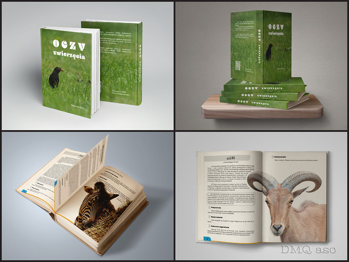
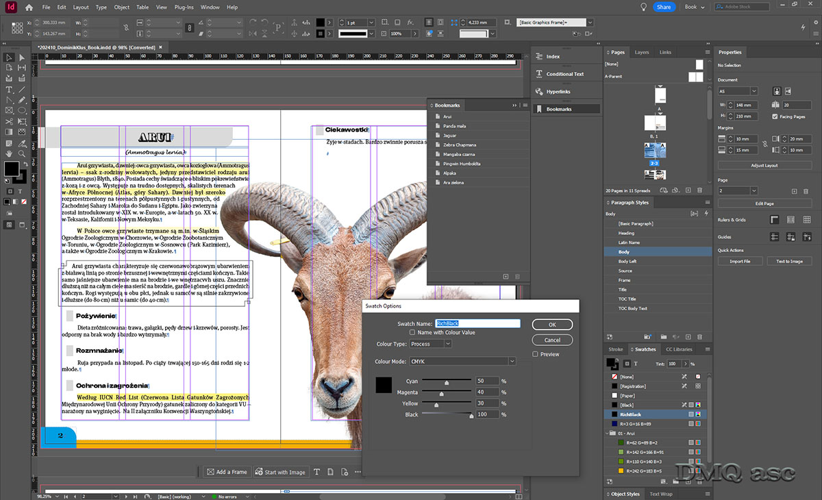
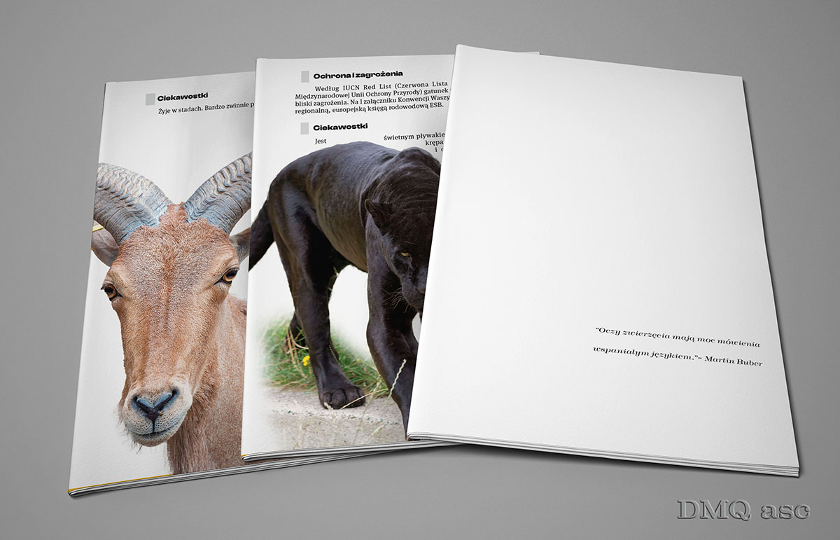
In this post, I’ve included 3 images. The first illustrates selected pages placed on unbound pages, also known as a product MockUp. It is the skill of applying text or graphics to any chosen object. The second image shows the illustration of the finished book, which is a hardcover book MockUp showing both the exterior and interior appearance. MockUps are a realistic reflection of a given graphic in real conditions, where the base could be a photo of a book, a billboard, or a metal can. The third is a screenshot from the Id program, showing some of the settings you can base your work on.
The book project illustrates the capabilities of the program and my approach to the topic. The text was taken from four sources listed at the end, while the photos were taken by me at the Krakow Zoo and published in a post on this profile on July 31, 2024.
Id does not allow for casual text or graphics; everything has its own specific style, which makes it easier and more systematic to process the entire collection of different types of pages. Below are some very concise settings for correctly creating a book or a larger outline:
- The book assumes an A5 format [148x210mm] and in my case has … 20 pages.
- Margins – 10-15-20-10[mm], respectively top, bottom, from the inside, from the outside.
- Initially, I based it on 3 columns with 4mm spacing, but due to the small format, I used the full page.
- Each text character was enclosed in paragraph styles, so by formatting a specific style, we change a particular text throughout the entire project.
- Initially, the plan was to use a sans-serif heading and serif continuous text, but in both cases, I used the serif version, following Adobe’s recommendation.
- The bleed was set to 3mm, with no specific information for the print shop.
- The entire Id file was saved in PDF format, preserving vector objects.
- Colors were saved in CMYK format, with the printing settings being ISO Coated v2 300% (ECI). Home printers prefer RGB colors, while print shops often use CMYK, although some prefer to convert it themselves since there’s no going back from CMYK to RGB.
- The black color was enriched with m50c40y30k100, where these numbers represent the percentage of magenta, cyan, yellow, and… key color (not black). K has different colors and is not always pure black. It’s the accepted black, but with varying saturation. To accurately define the color, monitor calibration may also be necessary. Strengthening colors prevents fading. The largest print shops use Pantone colors, which are specific colors not derived from a mixture of basic colors.
- Specific text styles account for specific frames or font differences.
- The animal graphics were created from PNG files, where the text is wrapped around the edges, so it doesn’t automatically overlap the graphic.
- The text was aligned to both sides, with the final alignment to the left.
- The yellow color marks text density, where white is the most suitable. This is to optically reduce excessive space between words. My setting is -5% and +5%.
- I completely disabled hyphenation (splitting words across lines).
- Single words were set to wrap to the next line.
- Text in quotation marks was automatically set to italic (cursive).
- Double spaces and double enters were eliminated from the text.
- The images used have an effective ppi above 350, but the print settings were kept at 300ppi (pixels per inch), which is the minimum for printing.
- The table of contents was completely generated automatically from the heading style (Heading) and directed to the currently corresponding page.
- The page numbering started from the third page, with full automation of the repetitive elements’ appearance.
- Sample colors were generated from the images and added to the document’s color library.
- Specific thematic sections were enclosed in separate tabs.
- The book’s interior was created in Id, while the cover was created in Illustrator with the same print settings, but with a slightly larger format (hardcover).
- Both the book and the cover were exported to review links in Adobe, which helps potential clients quickly preview and apply any corrections (links below).
- Contact (email and website) was paired with the appropriate links, here for the electronic version.
- All of the above settings can be imported into a new Id file to create a completely different book with the same styles or settings.
- Conditional text formatting, language spelling, or anchoring images were not applied here.
- I implemented optical text alignment.
- The above settings were applied according to my decision, although some are based on commonly accepted rules.
- The English-language version of Adobe programs (and others) greatly facilitates my internal communication between programs or people closely related to the topic.
Links:
Book:
https://assets.adobe.com/
Cover:
https://assets.adobe.com/
Source of the text:
https://ekologia.pl
https://pl.wikipedia.org
https://zoo-krakow.pl
https://zoo.wroclaw.pl
The selected graphics illustrate my skills in changing and affecting the visual appearance of a person, object, or landscape based on the original background. The final effect is subjective and covers a specific time frame. Each of us perceives things differently, and each of us has a different time frame or skill set. Posts published periodically with a specific thematic project aim to systematically collect materials illustrating graphic possibilities.
Enjoy watching!